Coffee Shop UX/UI Project
For this project, I introduced the UI/UX design concept, also known as User Experience Vs. User Interface is the process by which the user interacts with the brand and its products vs. how the user gets from point A to point B by navigating to and around the coffee shop along with the mobile navigation of the website. I was tasked to choose and research information about Borealis Coffee Company, located in Riverside, Rhode Island. I had to understand the User experience behind the coffee shop and why, where, what, and how they did what they did to remain successful. As the deadline for the project came to a close I was able to retain a deeper understanding of what User experience was compared to the User Interface.
Commercial Coffee Competitive Content Audit
Before I set off to find and choose our own coffee shop to rebrand I set out to look at the differences between Starbucks and Dunkin Donuts. I had to recognize what about the user experience made these two companies very different from each other. They were both pretty well-known popular coffee shops that are located at every turn in the world. I was tasked with going into 2 different Starbucks and 2 other Dunkin Donuts locations and analyzing the affordances and limitations that each location had to offer.
Commercial Coffee Competitive Content Analysis
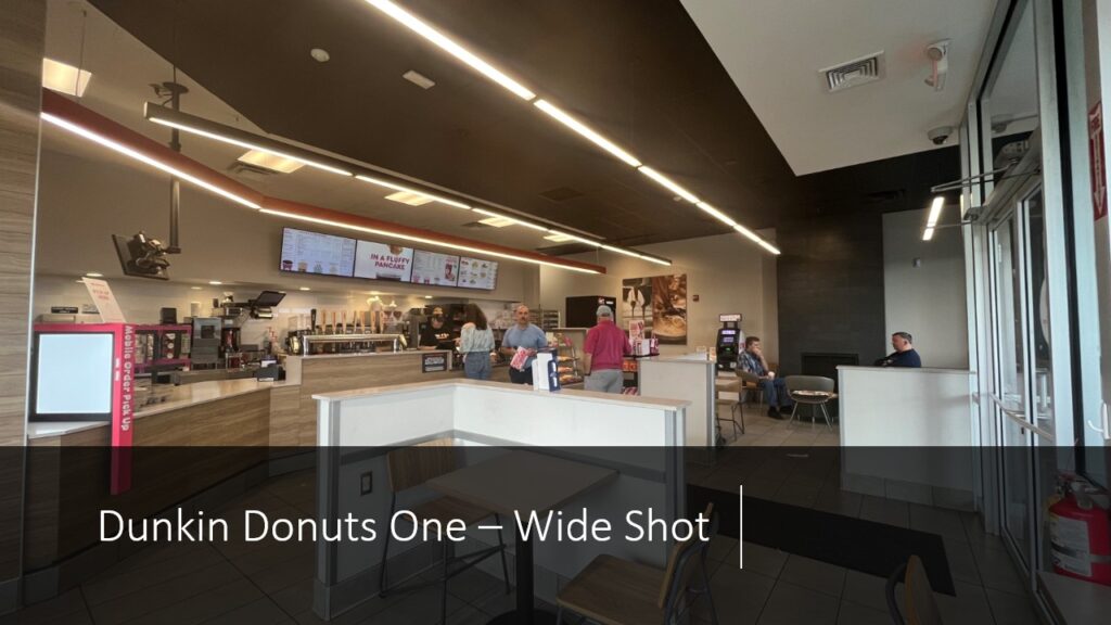
When I went to analyze the target persona along with nodes and waypoints of the location, it was apparent and concise. It was straightforward to move around the place and find what you were looking for. From the entrance of the door as you can see in the image is a straight pathway to the front counter where you are welcomed by an employee who will then proceed to take your order.
As for the nodes, there were very few. In the image above you can see the monitors that are hanging above the work area where you can see the variety of menu items. Around you their many tables and chairs along with a booth in the corner for comfort.
This Dunkin Donuts’ has shown that they do not specialize in the whole come in and sit down for an extended period of time rather they want to get you to want you to need and get out of there as quickly as possible, a grab-and-go experience.
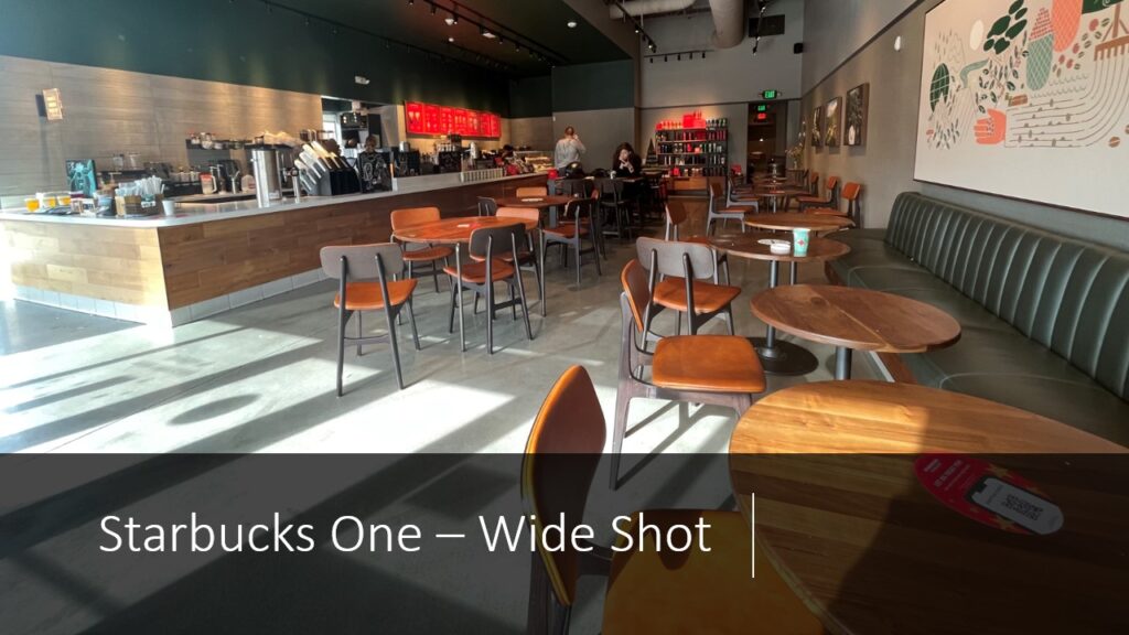
When I went to analyze the target persona, nodes, and waypoints of Starbucks, it was not very clear and pathways seemed to be endless. Still, it was a minimal interior so they could not seem to add many waypoints as far it goes, you can see in the image above that when you walk in you are welcomed by the long counter top which you appear to follow it along. You will see the cashier ready and waiting to take your order.
As for the nodes and waypoints, this has less than Dunkin Donuts. You walk in and you can use one of many ways to wherever you need to be. You have mobile pick-up signage that expresses to the customer that this is where you can pick up your mobile orders if you place one. To the right are tables and chairs along with a long booth section for comfort. Following the pathway made by the organization of the chairs and tables, you have a fire exit.
This Starbucks has shown that just like Dunkin Donuts’ they have a similar value proposition of fast service and getting on with your day.
Target Coffee Shop Content Audit
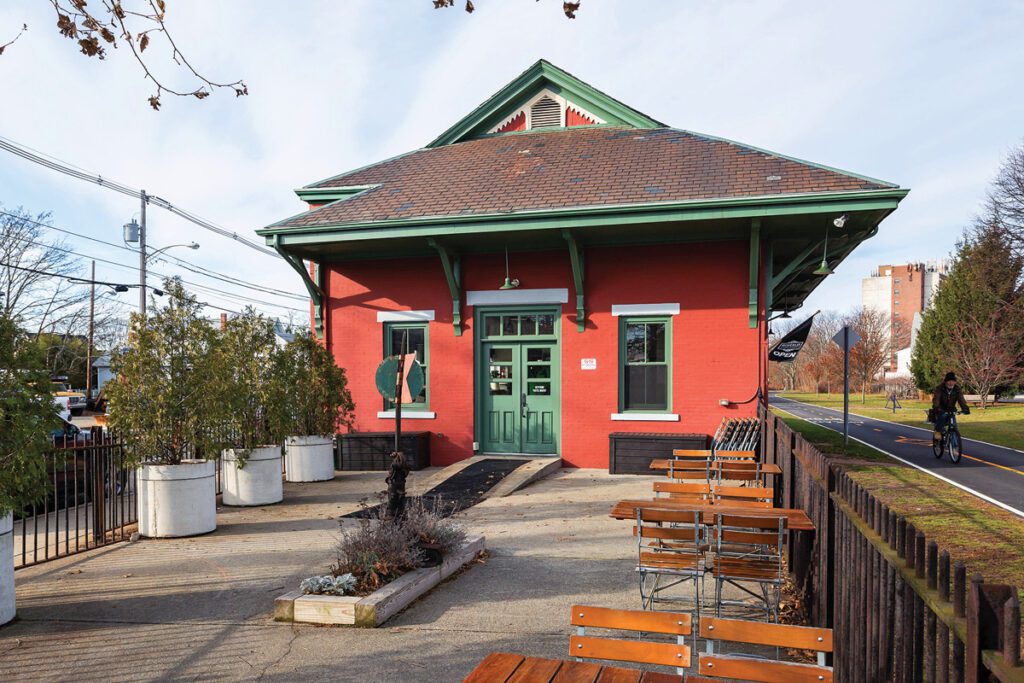
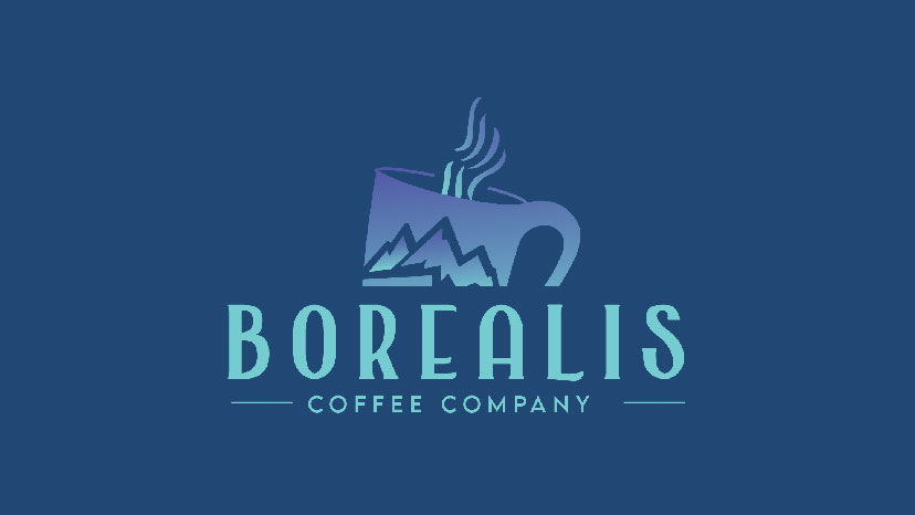
From what I learned about the user experience of Starbucks and Dunkin Donuts’ and applied it to the analysis of my chosen coffee shop. I was tasked with creating a target persona that appealed to a young adult audience, around 20-40. Borealis was not your average coffee shop, it invested in the idea of being different than Starbucks and Dunkin Donuts’ such as in a way where it was accessible to everyone, a few of their nodes were Bike trails/paths located adjacent to the shop along with outdoor seating for consumers to enjoy the scenery, old railroad memorabilia is found front and center of the coffee shop, lastly going inside consumers can find an old fashion coffee roaster. A lot of their user experience is built around a warm, welcoming aesthetic for young adult customers. Many of the stakeholders contain the employees, managers, nearby shops, and people coming just off the road or bike trail.
Borealis has many affordances some of which are the specialty menu items that appear in the shop and are advertised on their social media. They do not want to be known for just selling coffee and breakfast foods, they were going for something more vast in options. This has driven a lot of traffic into the company, however, their one main limitation would be the need for expansion rather than just staying local, they would probably drive in more people from around Rhode Island and also from Massachusetts as well.
Lastly Borealis has chosen to ignore most of its whitespace needs to ensure they stay different from its competition in the surrounding area. If went ahead and filled in what was missing then they would be just another average coffee shop. Borealis Coffee Company should be known as the location with coffee that is “Phenomenal Flavors…Naturally” and should be known for its fast service and relaxing environment.

Image of 20 – 40-year-olds hanging out, this is the Target Persona for the Coffee Shop
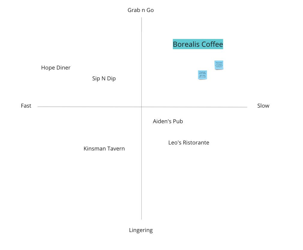
After analyzing the target person, I was tasked with highlighting the whitespace of the coffee shop, which simply meant where my target coffee shop stands compared to its competitors in the surrounding area.
According to the chart on the left, you can see a whitespace diagram of all the locations in the area and they all have their own value propositions of either fast service, grab-n-go, lingering, and also slow where my coffee shop stands alone in the category of Grab-N-Go but also slow tells me that Borealis wanted a coffee shop environment where people can get their food fresh but also come in and relax before being on their merry way.
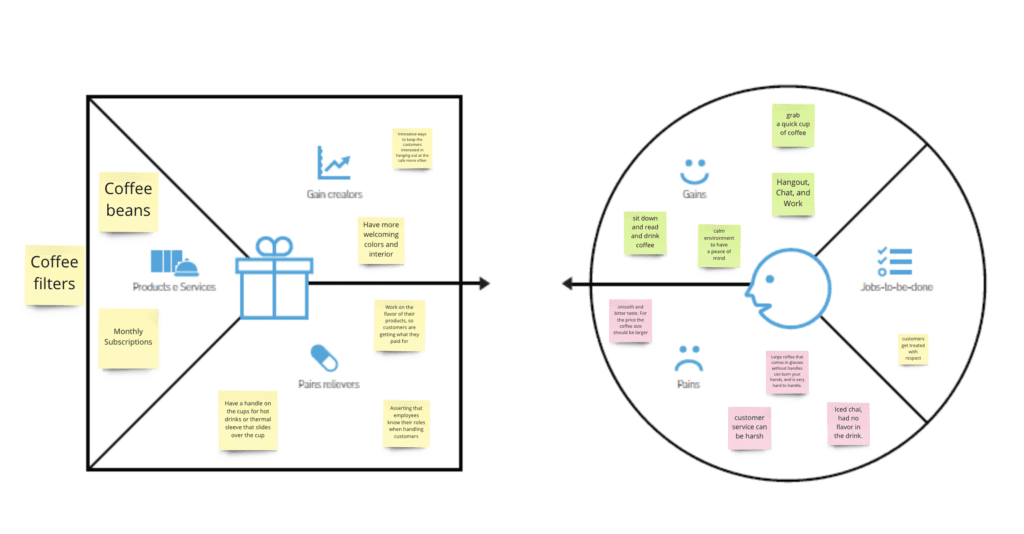
During the creation of the value prop canvas, I had to put together different groups of the pains and gains of the Borealis Coffee opportunities.
Borealis Coffee Company’s original value proposition was very interesting, it felt very warm and welcoming but I personally thought it needed to twist to make things feel more ‘at home’.
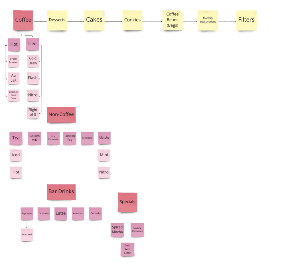
Hierarchy lists show the variety of menu items that the coffee shop has to offer. This allows me to understand where the whitespace is in the menu and what can be improved upon such as what new items to add or if there needs to be a change.
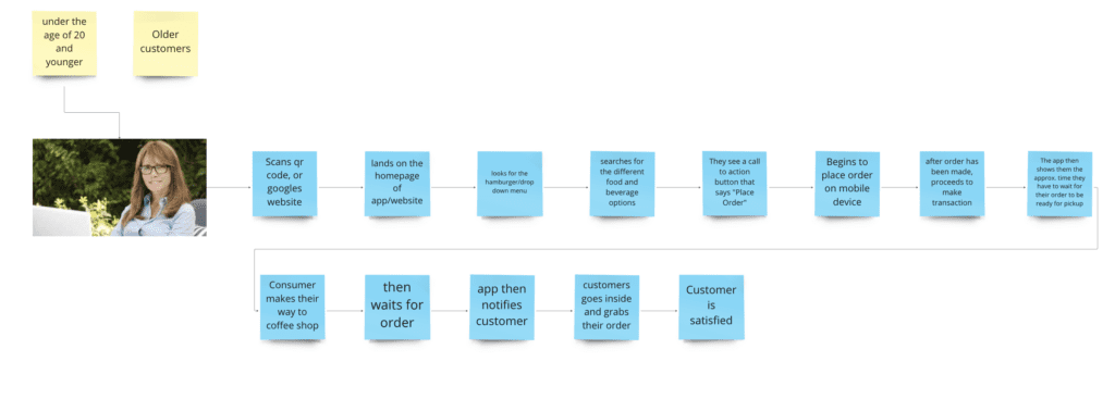
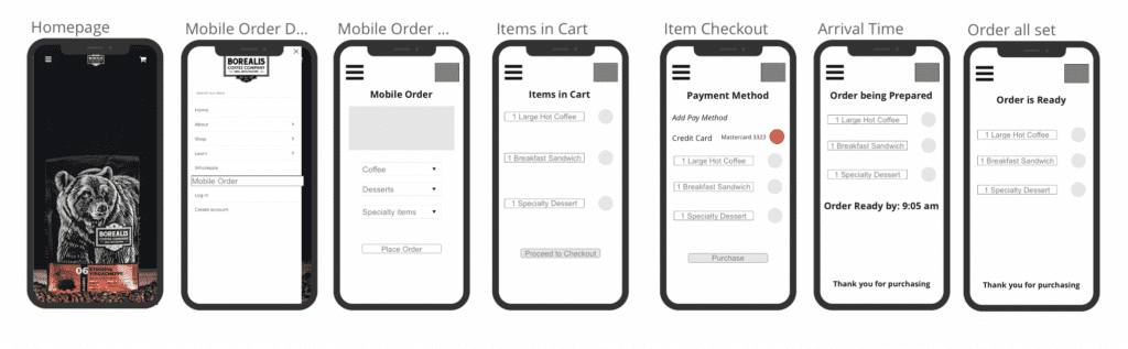
A journey map shows and highlights how the customer interacts with a product or service for the company. The map I have made is for how the younger audience, a male or female, age 20 or a bit older interacts with the mobile website for the company.

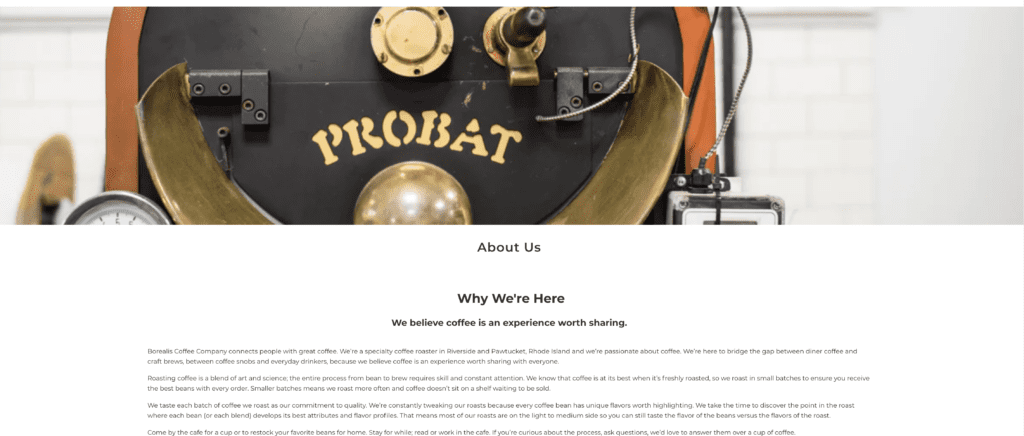
Borealis Coffee Company’s value proposition: “nature gives us natural phenomena that are life-changing. We aspire to give you that transformational experience in everything we serve.” How this has changed from the Coffee Company’s original proposition is it did not feel true to the roots, so I wanted to maintain a value proposition that represented what Coffee Shop stood for.
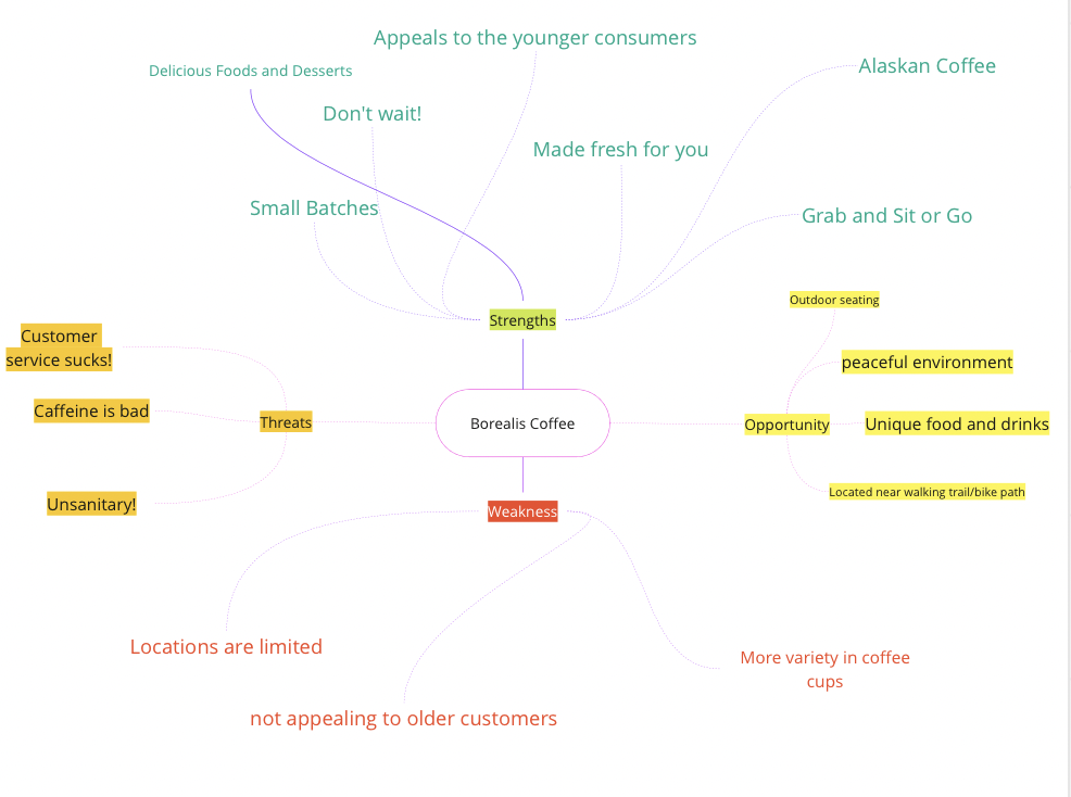
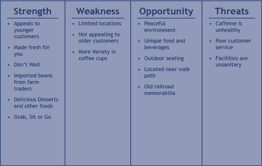
The main threats and weaknesses will come to eventually hurt the company, I believe recognizing this will allow the company to set a target on what they need to improve overall. The consumers really love the aesthetic of the coffee cups but they feel that if the batches are going to be made fresh, at least provide the user with some sort of protection so they are not burning their hands. Also mixing up the drink options so it shows that coffee is not the main highlight of the shop, especially if they are trying to isolate from the competition. Lastly making sure the company has a means to provide for the older audience and feels a lot more welcoming.
SWOT Diagram
The company has a good location, and good traffic for working and casual customers. The opportunity area is reaching out to older customers by adding quiet times, which would be better than energizing people.
Target Logo Evolutions
Target Logo Merch
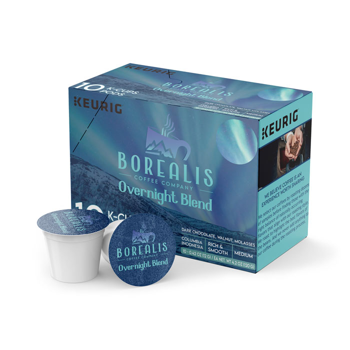
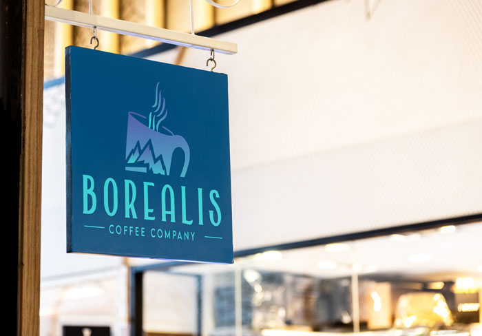
- Borealis Logo Iterations
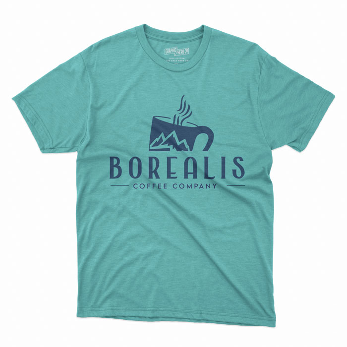
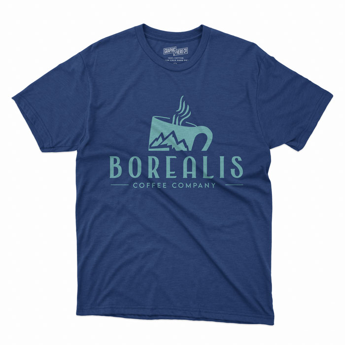
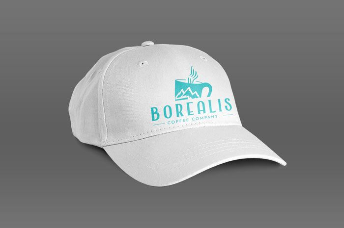
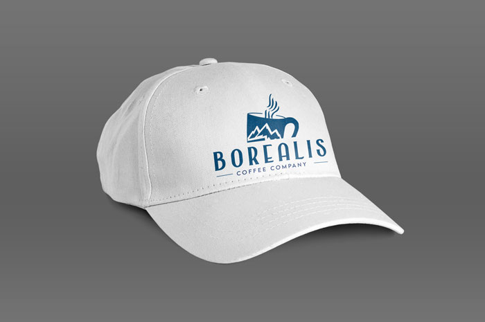
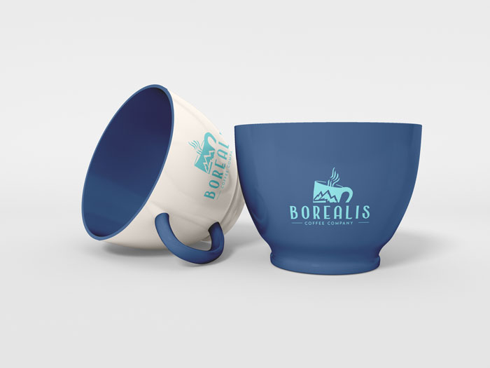
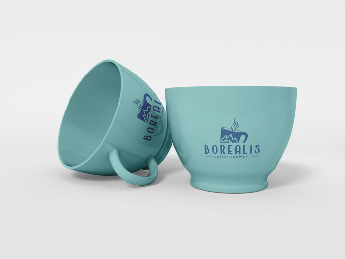
- Borealis Mockups
Target Mobile Website Wireframe
Target Mobile Website Prototype