Cookie Logo and Package Design
About the Cookie Logo
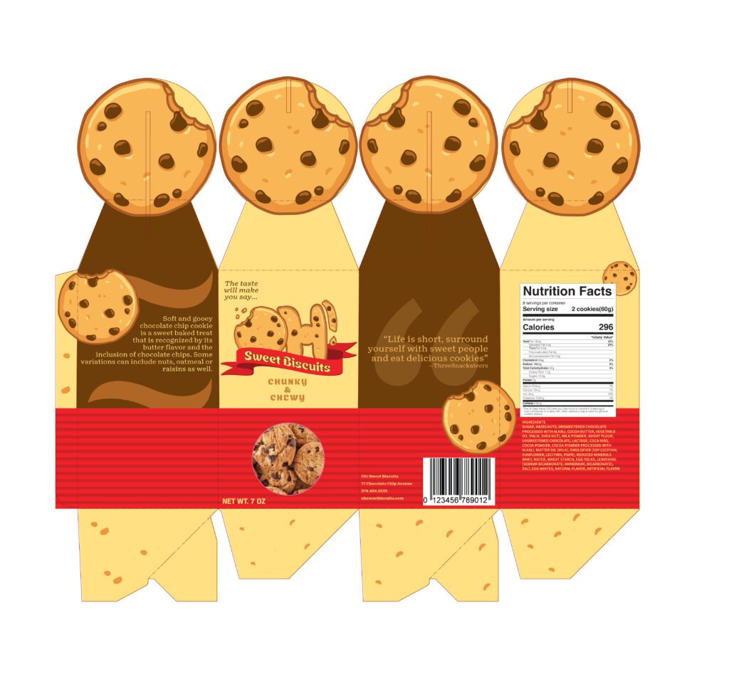
For the first part of this case study I will show you the thought process behind the development of my cookie logo. I used the first few weeks to consider carefully what kind of cookie I wanted to advertise. I was told to make 3 hand-drawn sketches to gather a logo concept while going to the store to take pictures of similar cookie packages. Following that step of the project, I had to assemble my very own nutritional label that would be an appropriate size for the cookie box. The last step of the cookie box packaging was to create the final design in illustrator using all the assets I brought together.
What You Need To Know…
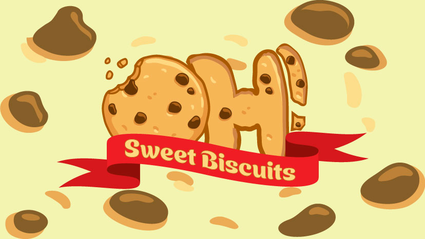
Oh! Sweet Biscuits is a gourmet cookie company, that also designs high-end packaging. An original logo that came together without questions, this asset was then moved on to make well-designed packaging that safely secures the product.
The target customers that would truly want to purchase are anyone who is looking for snacks in between meals, ages ranging from 6-40. Working within the perimeters of a vast age group, I needed to design a logo that was eye-catching enough for those passing by the shelves, along with a catchy name that will make say it all day long.
The Process Begins…
How the logo started
One early morning… I woke up really early, grabbed my book bag with my laptop and sketchpad headed to the main campus. Just as I arrived, I grabbed my morning coffee and bagel then sat down and started to prep my area. I pulled out my sketchpad and began to draw out the idea I had from last night. As I was drawing the first sketch, I had a few different ideas jump into my head so I decided to draw those and see what version I liked the most along with what iteration would come together smoothly in illustrator. (Note: the numbers on the sketchpad, I arranged them in a way of least favorite 4; to my personal favorite 1) as you analyze the sketches, look across the page as if you were reading a book.
What was the Challenge…
The overall challenge behind the project was assembling the logo in illustrator and finding a color palette that brought out each of the features in the logo. First, it was finding the right vector image of a cookie that looked real enough but also was more cartoon-like. Once I got that figured I had to make the ‘H’ and exclamation point look very similar to the cookie.
What was the final result?
How did you approach the challenge?
When it came to tackling the problem I realized I needed a solid bright background to make the chocolate chips and logo stand out. I went into illustrator and began to fidget around with the different colors on the wheel and looked at how the logo stood alone against each color. The second problem aroused when the ribbon was not wrapping around the ‘H’ so I had to find a way to use the illustrator tools to help me out with this one. To polish up the logo I needed to add a ‘roughen’ effect onto the letter ‘H’ and features of the exclamation point to bring more unity between the Cookie itself.
Time Span of the Project
The overall time frame of the project was set to take at least five weeks to finish up the cookie logo and package design and have the packaging printed by week six. However, things do not go according to plan as the packaging did not get printed until the ninth week. Even then there were still complications with the package design file that needed to be tweaked. Thankfully those changes that needed to be made were made. I was able to get my package design printed and assembled so it was ready for display.