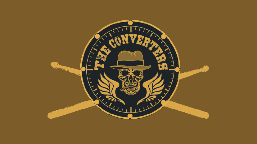
The Converters Logo Development
Empathize
Firstly before designing any logo, or starting any project. I had to analyze the target consumer closely to see what they would want.
Define
What is the project?
A new rock band by name of ‘The Converters’ wants a brand identity.
I was tasked to design an easy-to-visualized symbol for the band The Converters (similar to Guns And Roses) along with an identifiable text name. The logo is designed to evoke a blues, rock, and bike culture. Therefore putting myself in the mind of a target audience of 25-60-year-olds who are into classic rock, blues, and biker music.
Important Objectives:
- Easily recognizable visual that identifies with the name of the band.
- Easily supports and displays the band website: www.theconverters.com
- Looks excellent and effective in color and black and white
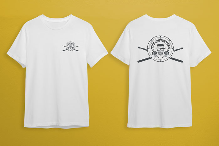
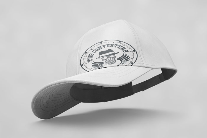
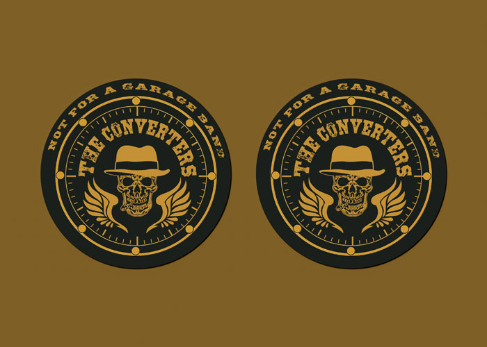
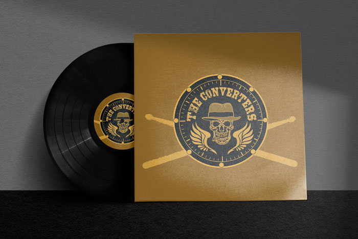
Product/Branding:
- Album Covers
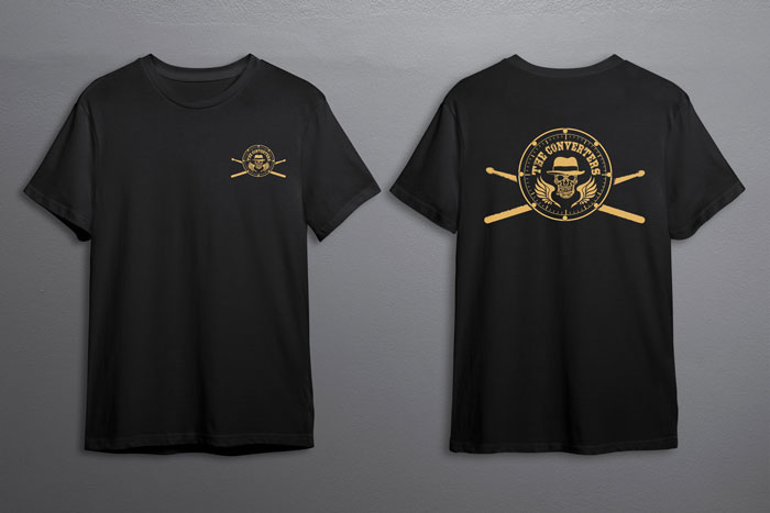
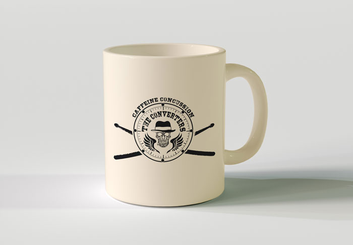
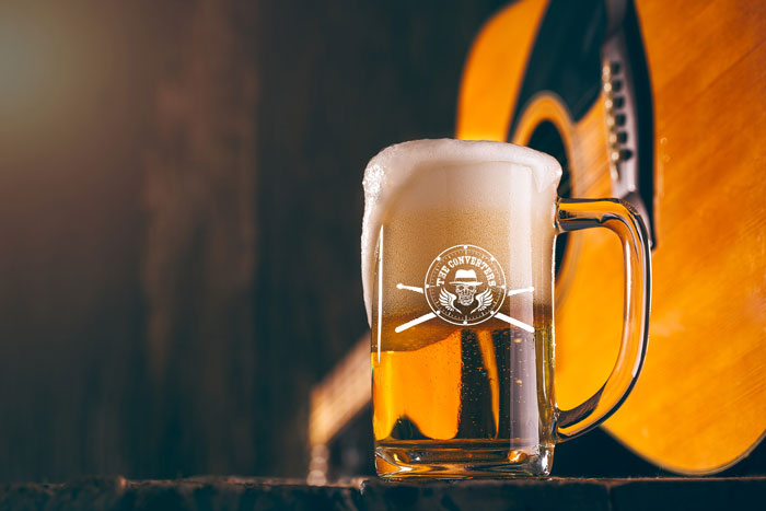
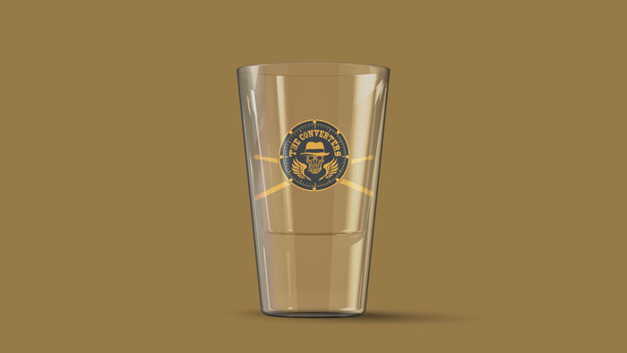
- Swag (hats, t-shirts, beer mugs, coffee cups/coasters, shot glasses)
- Stage backdrop
What is the overall budget?
When in the process of researching, sketching, creating iterations in illustrators and finalizing color and print for different products, my maximum budget was not to exceed $650 while delivering a logo that communicated an edgy, biker, and rock n’ roll style to the consumer. Meanwhile, through the development process, we had to time and then devise an invoice that showed a list of each item, and how long it took to do each step in order to figure out how much the project would come to in the end without exceeding the budget.
Ideate
Originally sketching my idea I was going for a crusaders and medieval style for the logo design, after rounds of feedback I decided that was not the path to go. So after doing a little more research on the different keywords biker, blues, and rock finding and creating some assets that suit the target audience.
Prototype
The new ideas of biker, blues, and rock cycle in for round 2 of feedback it was further discussed that the new logo concept works with the target persona.